General Feefo Analytics Functionality
TABLE OF CONTENTS
Introduction
The Feefo Analytics Dashboards provides users with a comprehensive overview of their feedback and review data, allowing for intuitive analysis and actionable insights. The layout of the Feefo dashboard is designed to facilitate ease of navigation and interpretation, featuring tiles, charts, and data tables to accommodate varying levels of detail and analytical depth.

Layout
Tiles for Top-Level Detail
At the forefront of the Feefo dashboards are tiles that offer a succinct summary of key metrics and performance indicators. These tiles serve as an entry point for users to quickly grasp the overall picture of their feedback and review data. They encapsulate top-level details such as overall rating scores, review counts, sentiment analysis summaries, and other pertinent metrics.
In some instances, these tiles may offer interactive functionality, allowing users to drill down into specific aspects of their data for deeper insights. For example, users can click on a tile displaying overall rating scores to explore the distribution of ratings across different product categories or time periods.
Charts to Visualise Patterns and Trends
Complementing the tile-based summaries, the Feefo dashboards incorporates a variety of charts and visualisations that enable clear identification of patterns and trends within the feedback data. These charts may include line graphs, bar charts, pie charts, and scatter plots, among others, depending on the nature of the data being presented.
Charts are instrumental in enabling users to identify emerging trends, track performance fluctuations over time, and compare feedback metrics across different dimensions. For instance, users can visualise the trajectory of overall rating scores over consecutive months, monitor fluctuations in review volume, or analyse sentiment trends associated with specific product features or service attributes.
Data Tables for Detailed Analysis
In addition to summarising feedback data through tiles and visualisations, the Feefo dashboards offers comprehensive data tables that afford users the ability to delve into granular details. These data tables present a structured view of individual feedback entries, encompassing attributes such as reviewer comments, ratings, timestamps, and product/service identifiers.
Users can leverage various filtering options and sorting mechanisms to refine their analysis and isolate specific subsets of data based on criteria such as review rating, date range, product category, or customer demographics. Furthermore, the Feefo dashboards empowers users to export data tables in common file formats (e.g., CSV, Excel) for further analysis or archival purposes.
Functions
Feefo offers a robust a reporting suite designed to empower businesses with comprehensive analytics and insights. Here's a breakdown of its key functionalities:
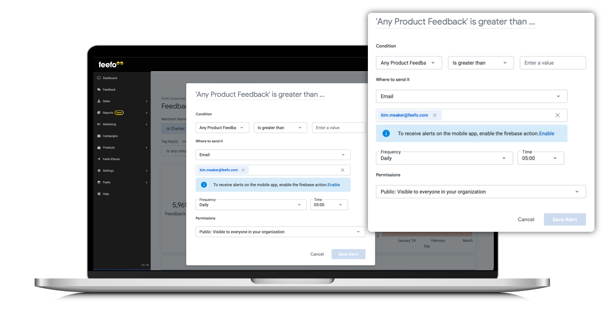
Alerts
Feefo's Analytics Dashboards feature an alert system denoted by a 'bell' icon. Users can set up conditions to receive email alerts based on specific metrics or thresholds within tiles and charts.
Scheduling
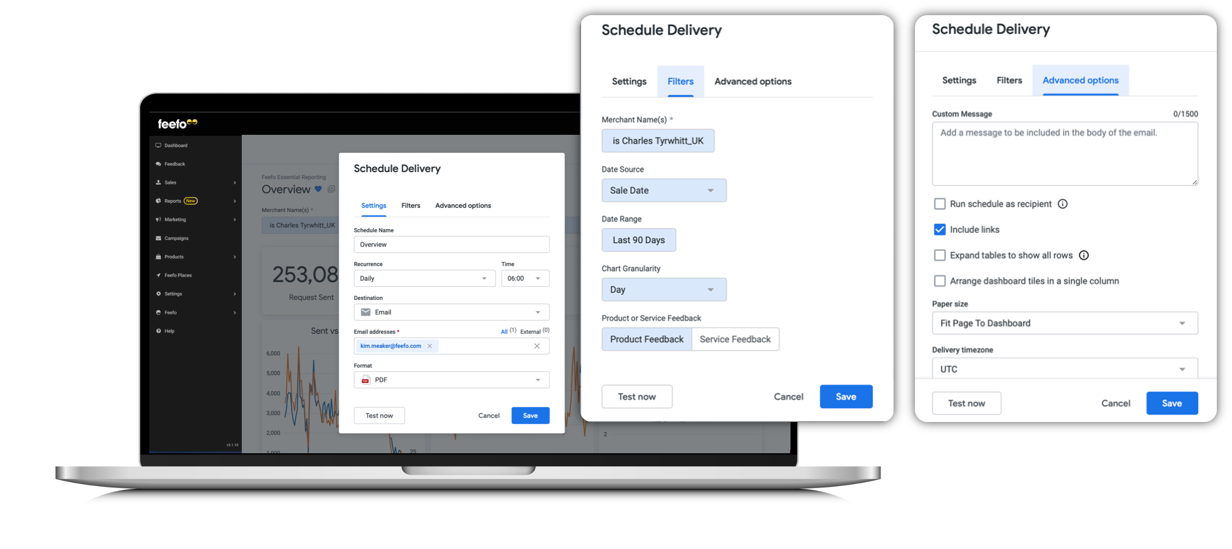
Users can schedule dashboard reports to be delivered directly to their inbox. By clicking on the icon located at the top right-hand corner of the screen (3 x vertical dots) users can set up regular delivery schedules for reports.
Settings
| Field | Description |
| Schedule name | The name of the the task |
| Recurrence | The cadence you wish to receive the document |
| Time | What time you wish to receive the document |
| Destination | Choose from
|
| Email addresses | Who you wish to receive the document |
| Format | What format the document should be received in
|
Filters - See specific page for filter selection
Drill downs from Tiles and Charts
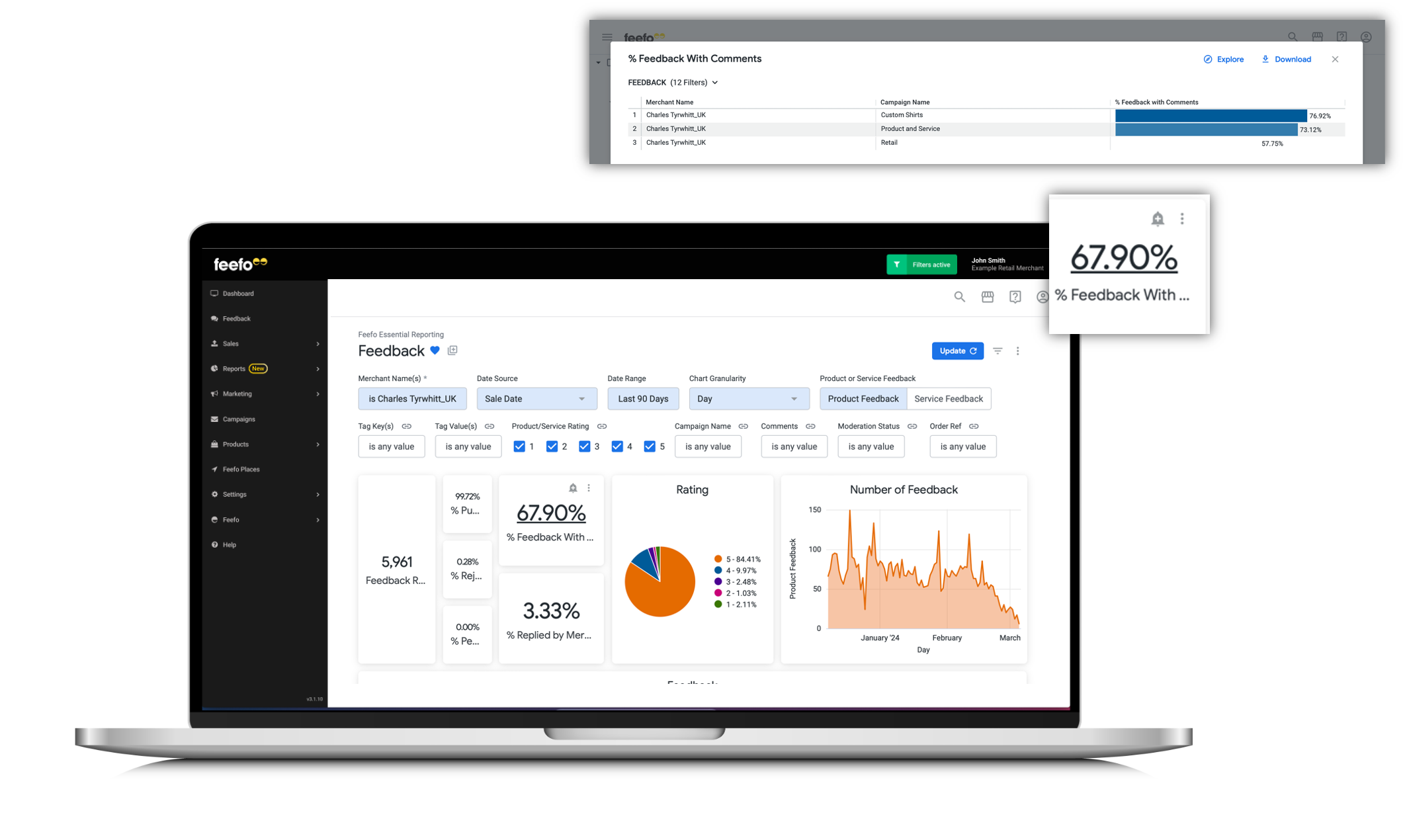
Feefo's reporting suite allows users to drill down into data directly from tiles and charts. Hovering over elements reveals underlined areas that users can click to access more detailed information.
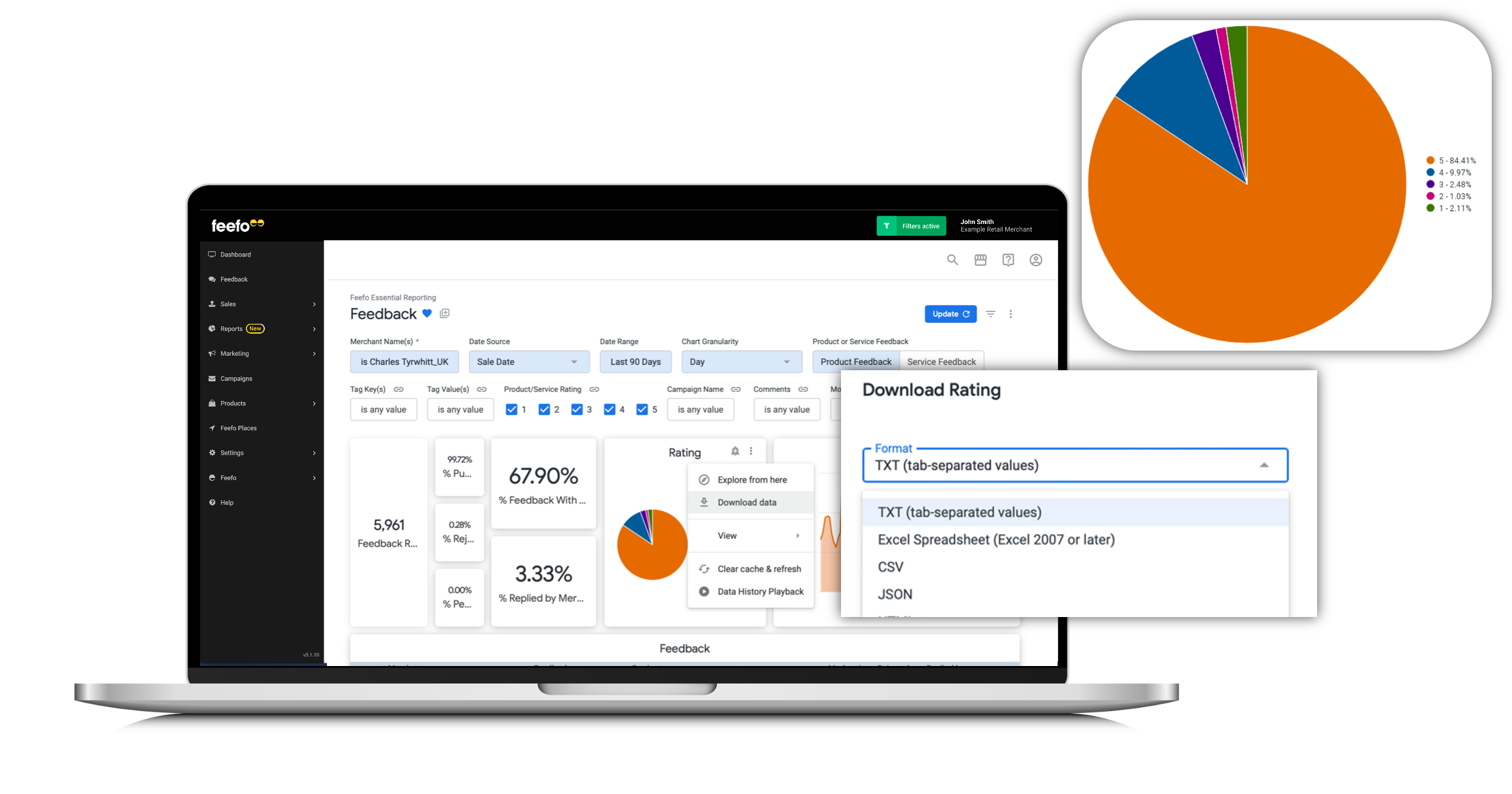
Downloading Raw Data
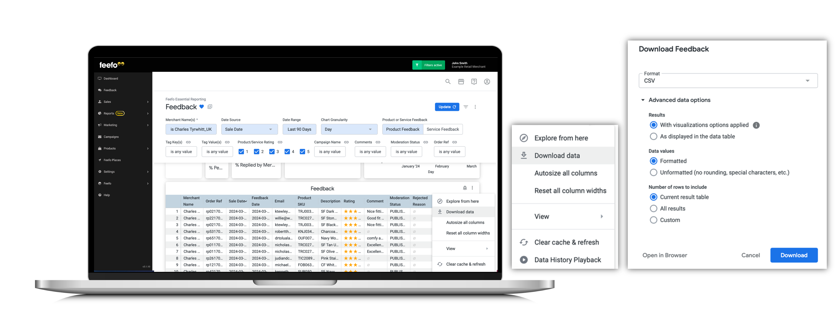
Users have the ability to download raw data from tables included in the dashboards. By clicking the icon with 3 x vertical dots on the data table or chart, users can access and export the underlying data for further analysis.
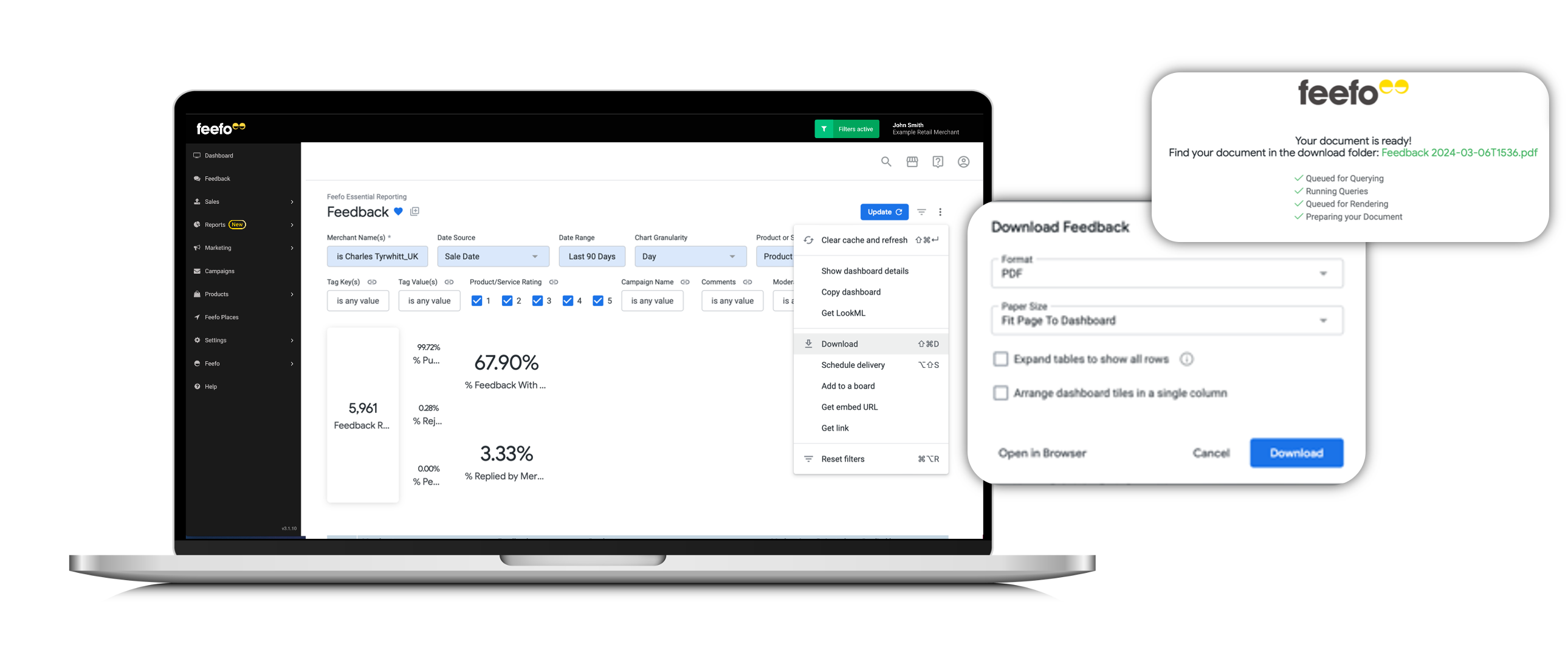
Downloading Tiles and Charts as Images or the whole dashboard
Feefo's reporting suite facilitates the download of individual tiles and charts as images or entire dashboards. This feature enables users to include visual analytics in presentations, merchant board reports, or other documentation.
Note, visualisations are limited to 500 rows. If you want all results, select As displayed in the data table.
Individual Image Download
Users can download specific tiles or charts as images for easy integration into presentations or reports.
Whole Dashboard
Feefo allows users to download entire dashboards as PDF or CSV files, preserving the layout and visualisations for offline viewing or distribution.
Summary
Feefo's Analytics Suite provides businesses with a comprehensive set of tools to analyse, visualise, and share data effectively. With features like alerts, scheduling, drill downs, and data exporting, users can gain valuable insights and make informed decisions to drive business growth and success.